

Typography is one of those areas of design that is often treated as secondary - a choice made after the substantial decisions about layout, colour, and interaction have been settled. The evidence suggests this is exactly backwards.
Fonts register on the visual system near-instantaneously, before conscious processing has begun, and they carry associations and emotional charges that shape the entire context in which everything else on the page is read.
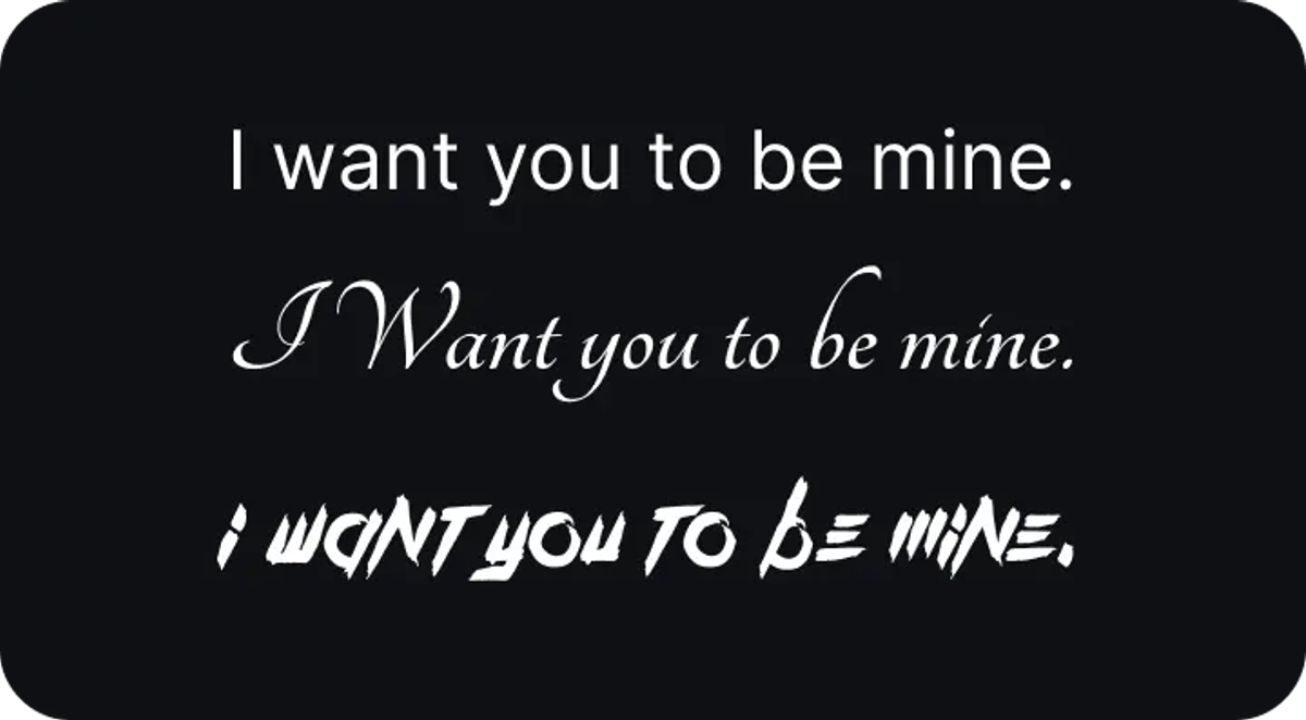
The reason sits in a well-documented tendency of human perception: we anthropomorphise visual forms, attributing personality and emotional character to the shapes, weights, and rhythms of letterforms. A font can read as angry, formal, playful, or authoritative not because it contains any of those qualities in an objective sense but because we bring our experience of those qualities to the visual pattern in front of us.
This is not an idiosyncrasy, rathert a fundamental feature of how visual cognition works.
Emotional responses

Because our first response to visual stimulus is emotional rather than analytical, fonts are one of the highest-leverage tools available to the designer. The effect is amplified by the Picture Superiority Effect - the well-established finding that images are better retained in memory than words.
Typography, which sits in a productive space between the two, benefits from both: the immediate emotional impact of visual form and the semantic content of language, fused in the experience of reading.
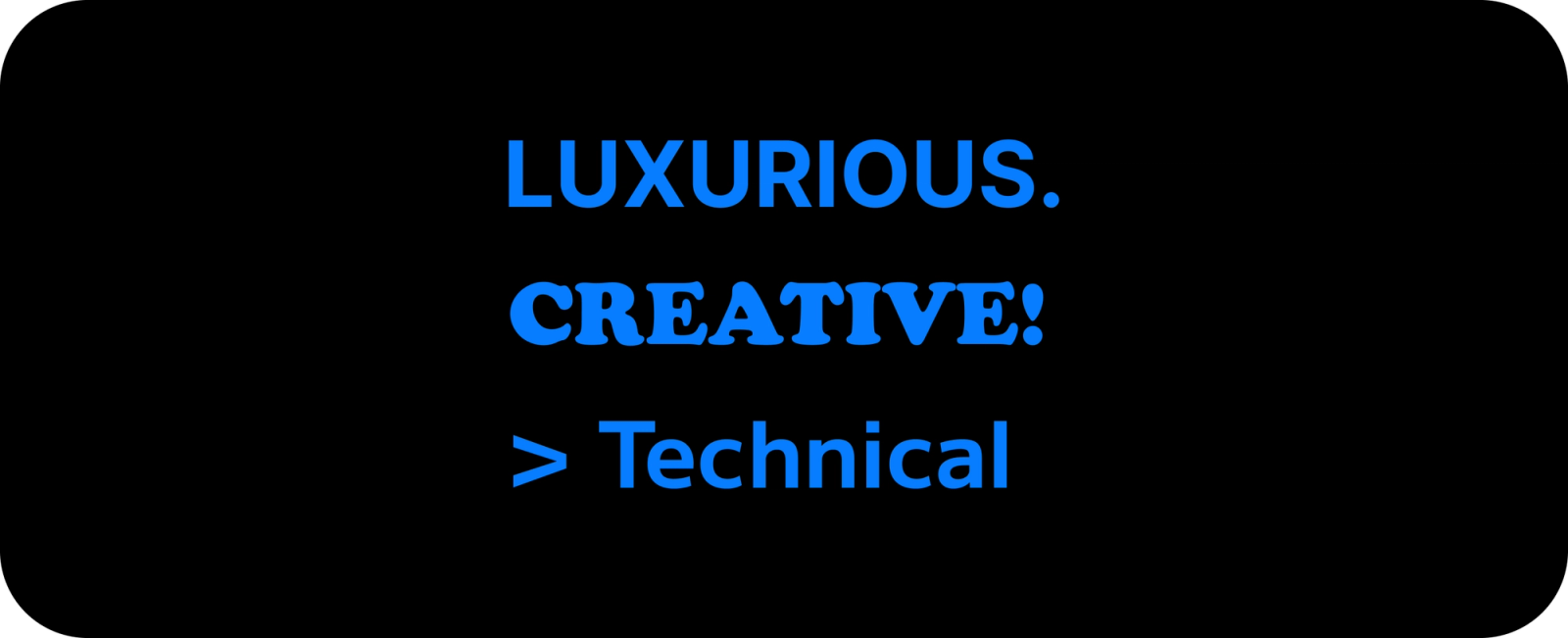
Every typeface maps somewhere on the emotional spectrum. The six broad typeface categories each carry a distinct emotional character: serif typefaces signal tradition, authority, and trustworthiness; sans-serifs read as modern, clean, and accessible; script fonts convey personality and craft; display fonts are expressive and often dramatic; monospace carries a technical, precise character; and condensed type communicates density, urgency, and strength.
A government institution reaches for a condensed sans-serif to display stability and authority; a heritage watchmaker uses a classic serif to communicate timelessness; a children's brand uses a rounded sans to signal warmth and approachability. These are not accidents but the application of a well-understood vocabulary.
Influence
The practical power of font choice extends beyond emotional tone. A typeface that feels right for a brand does more than carry appropriate associations; it establishes a context that frames everything that follows.
A product launched under a clean, high-contrast sans-serif enters the user's perception differently than one launched under a heavy display face - not merely in terms of aesthetics but in terms of what kind of organisation this feels like, what kind of relationship is being proposed, and whether the user's implicit expectations are being met or subverted.
The implication for UX design specifically is that font choice is never neutral. Every typeface choice makes an argument about what this product is and who it is for; the question is only whether that argument is being made consciously or by default.
Desirable difficulty effect
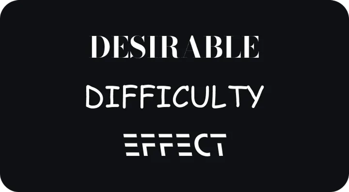
One of the more surprising findings in typography research is what researchers call the Desirable Difficulty Effect: the counterintuitive observation that fonts which are harder to read can actually improve the retention of information. The idea is that when reading requires greater cognitive effort, attention increases; and when attention increases, the material is processed more deeply, which improves recall.
Comic Sans, famously derided as unprofessional, turns out to be a reasonably effective vehicle for information retention - not a defence of its aesthetic character, but an illustration of how the relationship between readability and retention is more complex than it first appears.
In 2018, RMIT University created a typeface called Sans Forgetica on this principle, designed specifically to aid information recall through unusual gaps in its letterforms. Its effectiveness has been contested in subsequent research, but the underlying principle stands and has real implications for contexts where retention matters: educational interfaces, health information, onboarding content.
Friction, applied with intention, can sometimes serve the user better than the path of least resistance.
In Summary
Typography is a discipline with far more depth than any single post can contain - in both psychological and artistic terms. What is clear is that font choice is one of the more consequential decisions a designer makes; it shapes the emotional register of everything else on the page, and it does so before a single word has been consciously read.


