
HOW UX STRATEGY DROVE MEASURABLE BUSINESS IMPACT
ACROSS 1,800+ RETAILERS
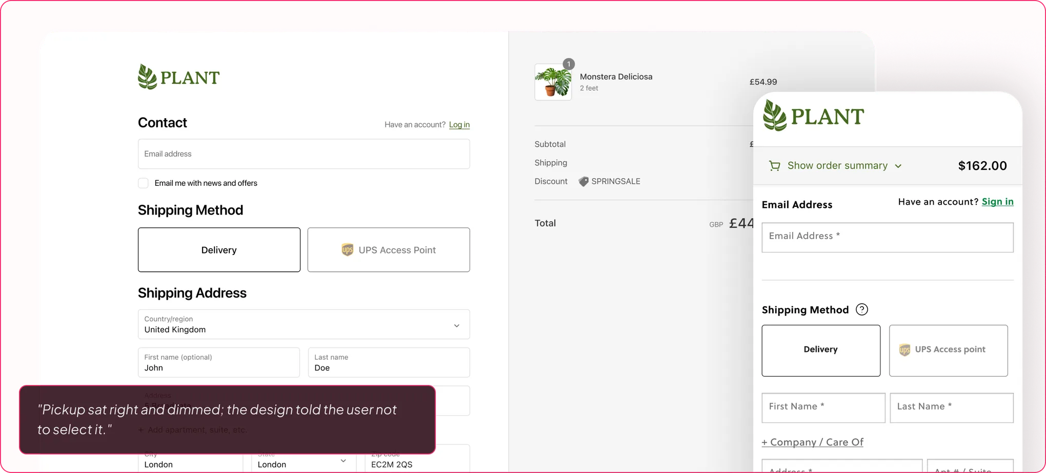
Most teams treat low pickup adoption as a visibility problem: fix the tab, add a badge, write a better line of copy. The data said something more uncomfortable. Shoppers were not confused; they were making a rational decision under uncertainty, and pickup was not winning it. Once the problem is a decision rather than a display, the design job changes. It stops being about surfacing pickup and starts being about resolving the four things a shopper is actually weighing: cost, speed, proximity, certainty.
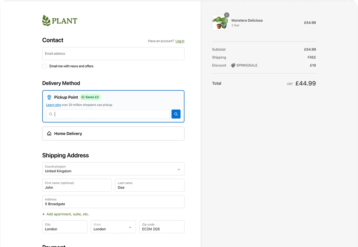
Every shopper arrives at checkout with a default: home delivery. That default is powerful because it requires nothing from them. To move a shopper off it, pickup had to resolve a trade-off across all four axes simultaneously.

I owned the end-to-end UX of the shopper-facing pickup journey, from the checkout method step through location selection and confirmation, including research methodology, A/B testing infrastructure, and translation of findings into design & product direction.
Ranked free delivery top 3
Shoppers weren't anti-pickup on cost; they were opposed to uncertainty. Clarity between home delivery and pickup costs resolved this.
Ranked timing top 3
Shoppers needed less ambiguity towards timing. "Next day" outperforms "fast": factual language beats promotional claims.
Proximity engagement in the Widget
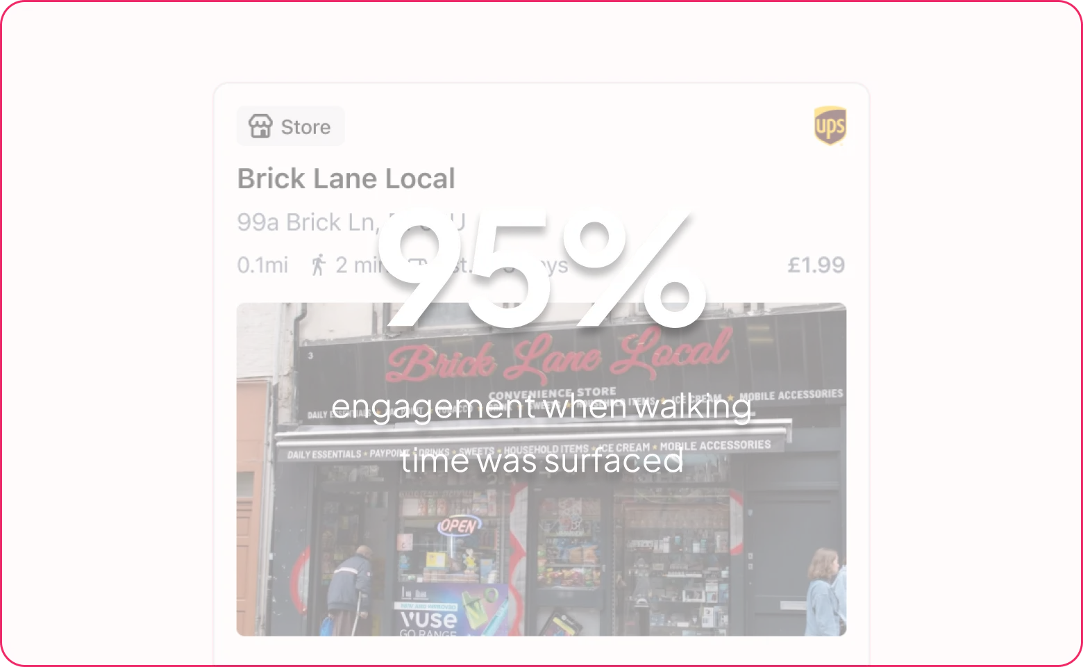
Distance in metres keeps the journey abstract. "2 min walk" lets shoppers picture leaving, walking, arriving.
The diagnosis: unresolved uncertainty accumulating across the decision. The design job was clarity and compression, not more information.
Before any of this, the pickup take rate sat at 0.7%.
Full shopper journey: LaunchEx → Widget selection → Confirmation
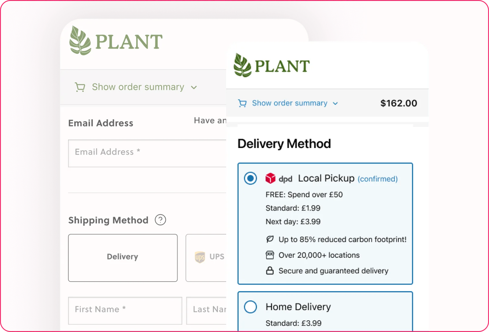
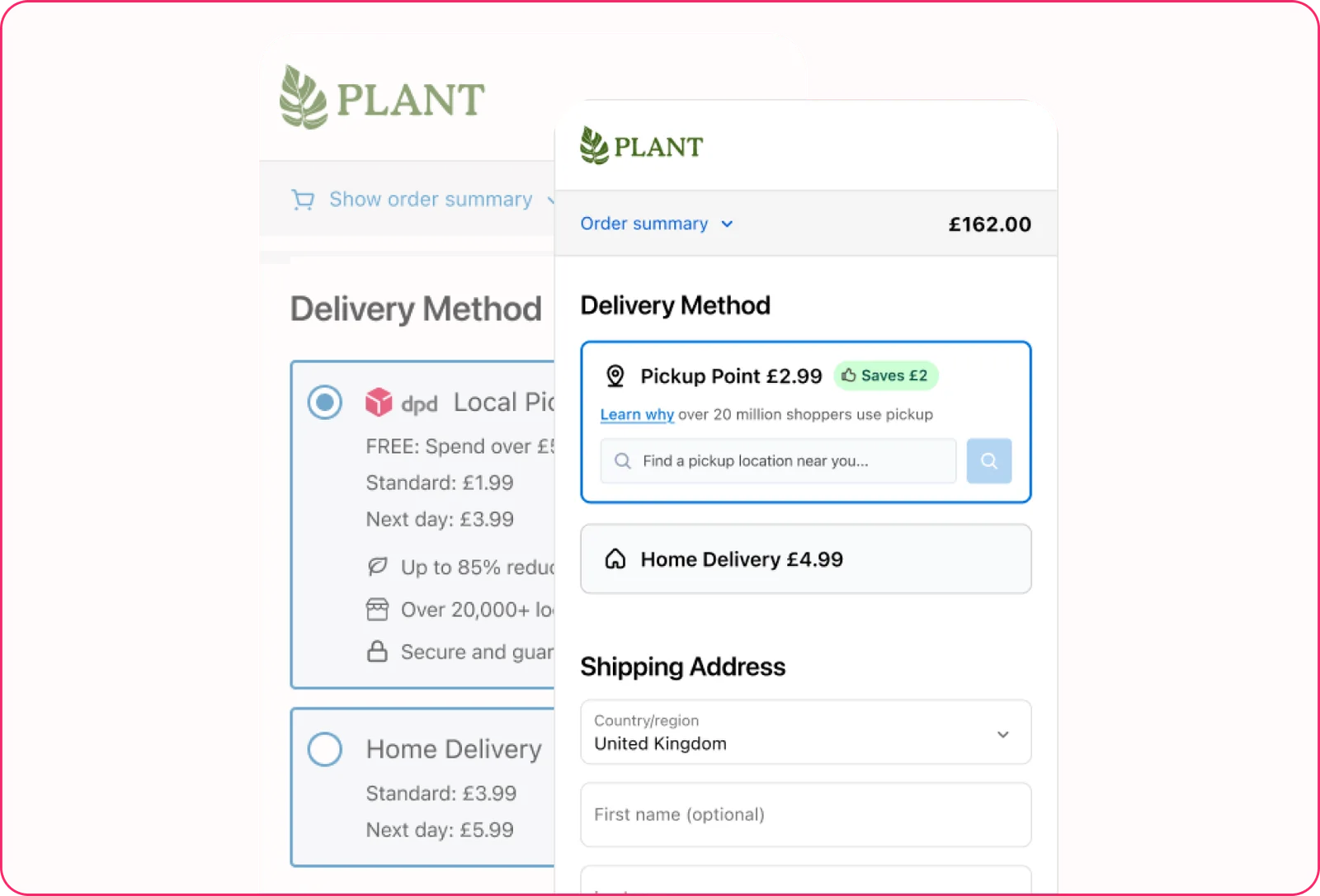
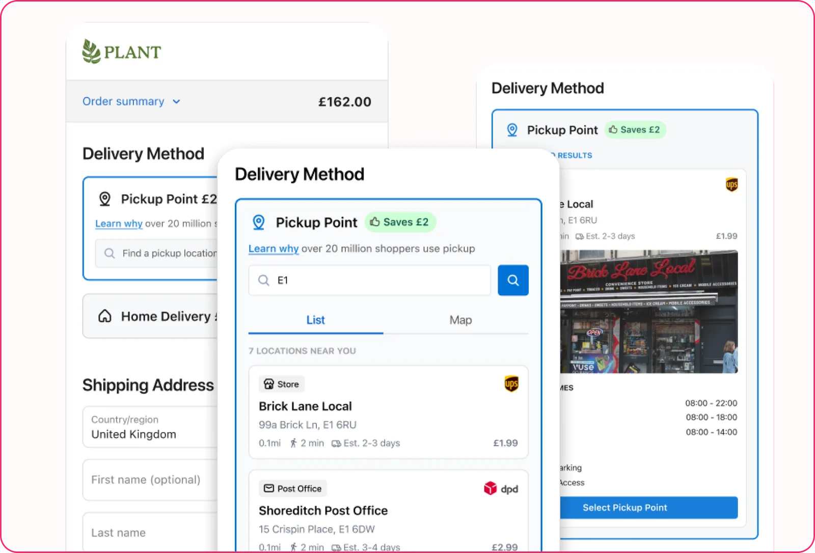
0.7% → 12% → 0.7% → 12%
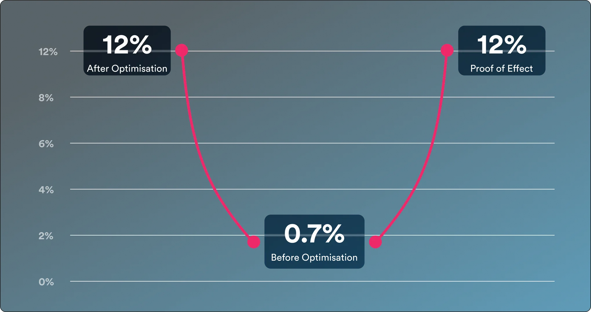
I removed the optimised version deliberately,
watched take rate drop back, then restored it. A designed experiment to prove mechanism.
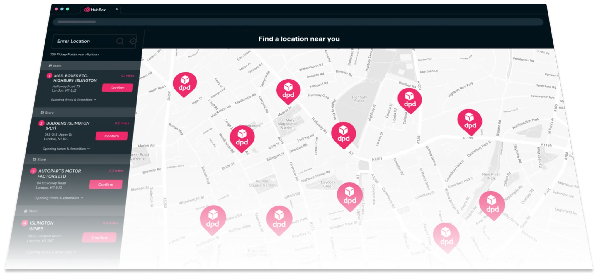
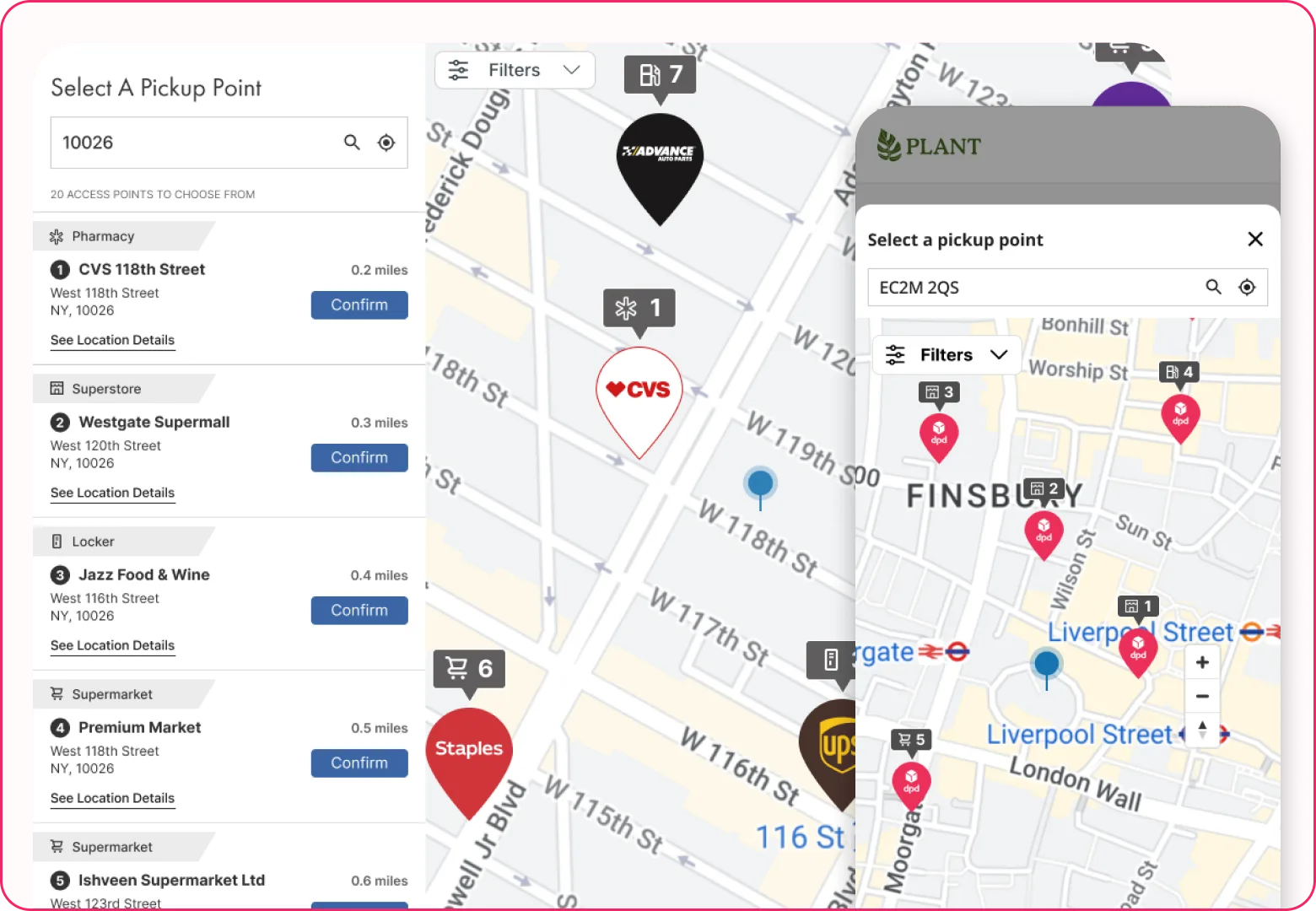
At the LaunchEx, the job is persuading a shopper that pickup is worth considering at all. Inside the Widget, the job changes: make it easy to choose a specific location with confidence.
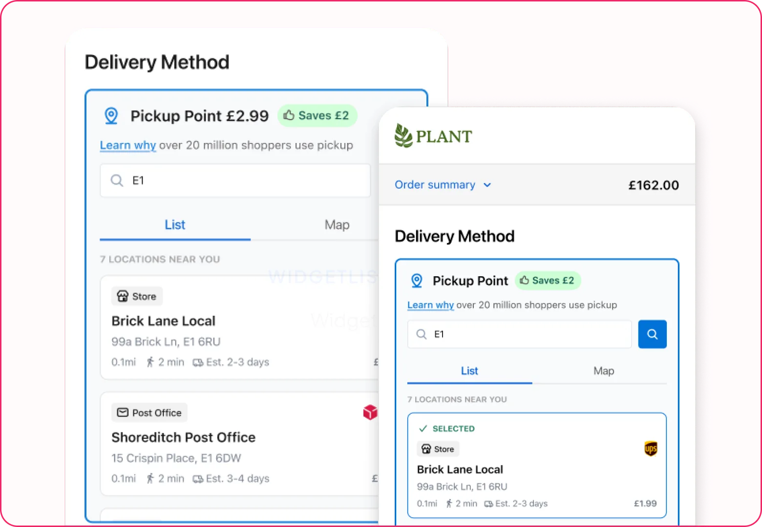
Pickup pre-selected by default redistributes effort: instead of requiring active selection to try pickup, it requires active selection to leave it.
One technical constraint had previously blocked this: the Widget needed to open on selection, which made a pre-selected state awkward. That constraint dissolved when I moved selection inline.
Something I'd known was high-performing finally became something the team could actually ship. The shopper remains free to choose home delivery throughout; the asymmetry is in effort, not in options.
The most significant thing this project changed about how I work isn't visible in the product. Conversion problems are rarely purely design problems; they're organisational ones too.
Shopify introduced repeated friction between what research indicated was right and what was technically possible to ship. Navigating that without losing the design argument was a consistent challenge.
Any change to a live conversion page is treated with real caution. The design argument had to be made not just in design reviews but in sales calls and commercial conversations.
Involve engineers too early and the solution becomes engineering-led. Involve them too late and you're iterating against constraints that could have been surfaced months before.
The mechanism that allowed us to move at all was the A/B testing infrastructure: not because it bypassed client concerns, but because it made the answer empirically available rather than rhetorically argued.
The most consistent pattern across this work is that the strongest design argument is results. Build the infrastructure to generate and prove, and design becomes a resource beyond visual.