

BUILDING A SCALABLE DESIGN SYSTEM FOR WONDR: ENABLING CONSISTENCY ACROSS A GROWING HEALTHCARE PLATFORM
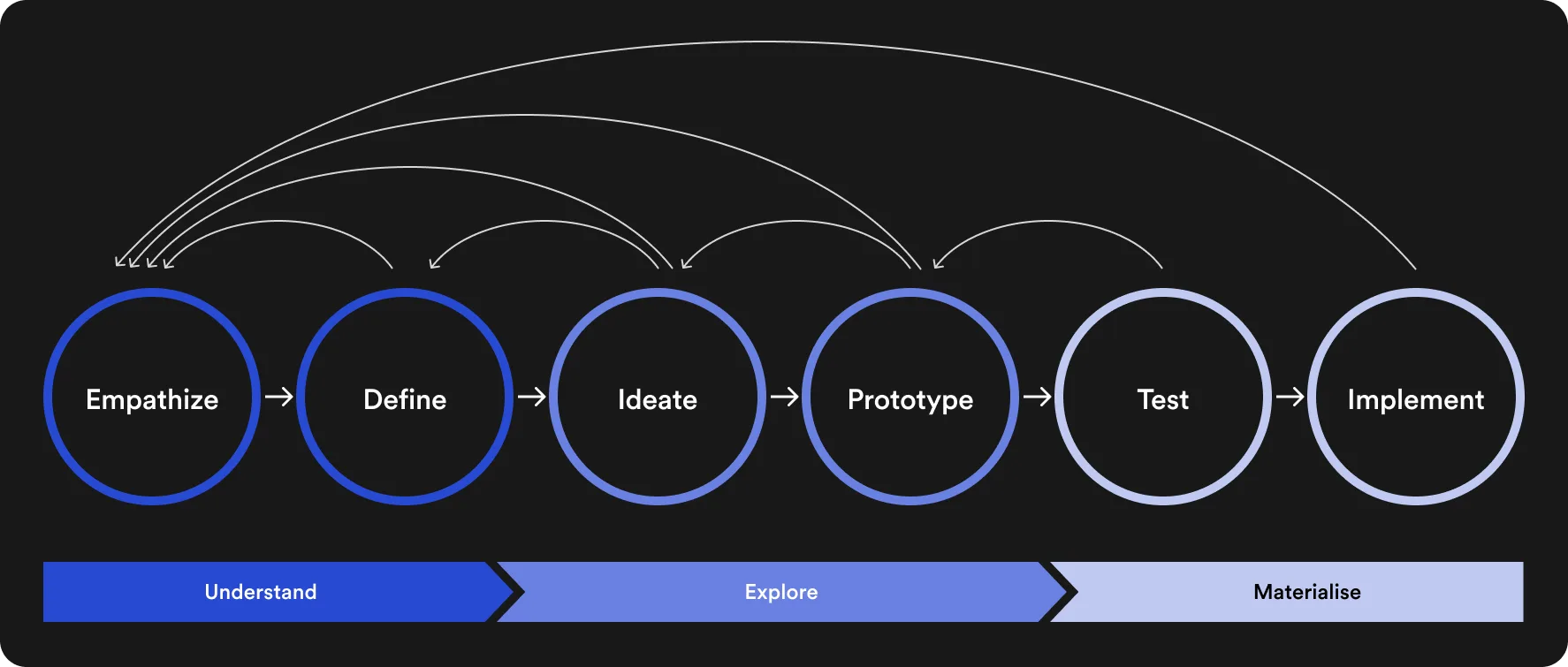
Years of fragmented experiences across Wondr's products revealed the need for a unified design system. Inconsistencies were slowing delivery, creating usability issues, and increasing maintenance overhead.
By defining a shared library of components, patterns, and principles, I improved consistency across the platform, allowing users to transfer familiarity between products and enhancing overall usability.
Internally, the system became a single source of truth for design and development teams. It streamlined collaboration, reduced duplication, and accelerated feature delivery by giving teams a solid foundation to build from.

Unify the experience
Create a single language for UI components & interfaces

Accelerate Design
Enable faster, more consistent feature delivery

Improve Collaboration
Align design & engineering workflows

Ensure Accessibility
Enforce WCAG 2.1 AA inside the components themselves

Reduce Maintenance
Minimise complexity & duplication through re-use

Support Scaling
Allow modular & flexible growth as Wondr scales
Wondr connects healthcare professionals across borders, so the design system needed to reflect the values at the heart of that mission.
The guiding principles I set:
• Universal Usability: interfaces must be intuitive regardless of role or region
• Trust & Credibility: design choices must inspire confidence in critical environments
• Accessibility: everyone should be able to engage, regardless of ability or setting
• Adaptability: scalable patterns that flex across products, devices, and contexts
• Cohesiveness: a unified visual language to ensure consistency across touchpoints
These principles shaped every component, helping the team create interfaces that feel familiar, dependable, and clear, while supporting seamless communication in high-stakes healthcare settings.
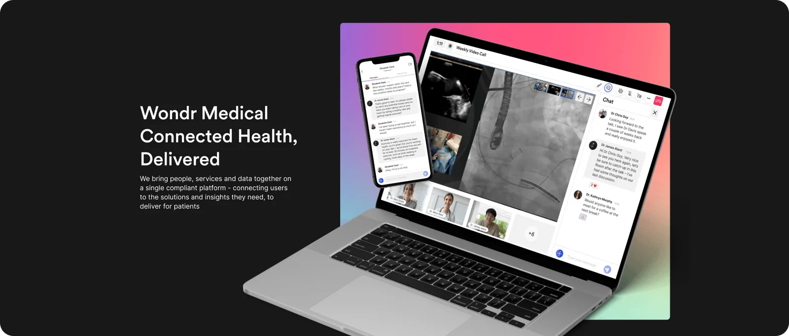
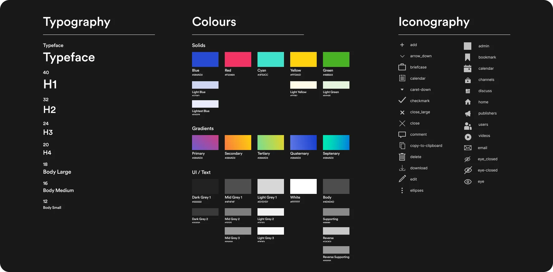
The W_ System defines a cohesive visual identity that gives all Wondr interfaces a clear, considered, and brand-aligned look.
This consistency enhances user trust and recognition, and reinforces Wondr's mission of seamless, meaningful connection in healthcare.
Beyond external impact, the visual system also improves internal workflows. By standardising layout, type, colour, and iconography, teams across design, engineering, and product can move faster, focusing less on recreating basic patterns and more on delivering high-impact features.
A design system is mostly a sequence of trade-offs, and the ones worth recording are the places where the obvious answer was wrong.
DECISION 01
The default for a design-led system is to treat the Figma library as canonical and let engineering mirror it. I rejected that. A mirrored system drifts the moment a developer patches a component under deadline, and the drift is invisible until someone notices two products disagree.
Connecting the library to Storybook meant engineers consumed the system in the medium they actually build in, and any divergence surfaced in code review rather than in a quarterly audit.
The cost: design changes stopped being unilateral. Anything I shipped in Figma now needed an engineering counterpart before it counted as real, which slowed the system down and made it considerably harder to abandon.
DECISION 02
Healthcare invites the instinct to aim at WCAG AAA, and for a product used in clinical settings that instinct is easy to defend in a meeting. It does not survive contact with a real palette. AAA contrast at 7:1 removes most of a brand's usable colour range, and several AAA criteria have no coherent reading for a complex data interface.
I set AA as the enforced floor and built it into the components themselves: contrast ratios fixed in the tokens, focus states and target sizes baked into the primitives, so a team could not ship an inaccessible button without actively working around the system.
The cost: a target that is honest rather than impressive. A system claiming AAA it does not meet teaches teams that the standard is decorative, and that is a worse outcome than a lower bar that actually holds.
Driving adoption was never about introducing a system; it was about embedding it into how teams already worked.
I worked with engineering and product from the start, so the system solved problems they recognised rather than ones I had assumed.
Once launched, I ran targeted workshops, published practical documentation, connected the library to Storybook, and wrote contribution standards that encouraged ownership across teams.
By empowering internal advocates and streamlining integration into active workflows, the system reached over 80% re-use rate across live projects within months, and 4x the adoption of the previous library. Cross-team collaboration improved and product delivery accelerated.
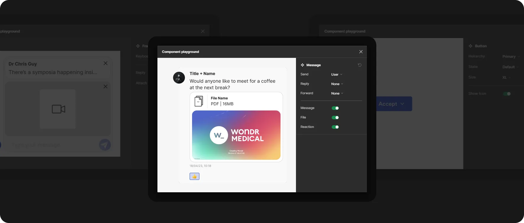
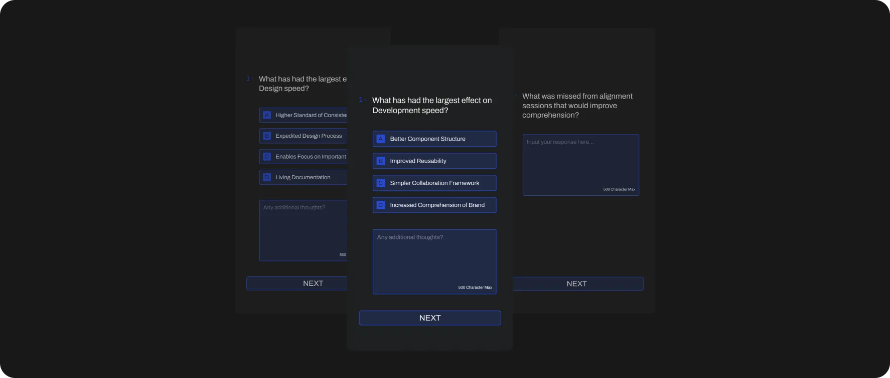
Ongoing feedback was essential to ensure the system evolved with the product and remained useful across teams.
I created structured feedback loops through regular check-ins with design, product, and engineering.
These sessions helped us identify edge cases, friction points and unmet needs early, before they became blockers.
I led over 20 feedback sessions post-deployment, resulting in 15+ component updates and revised usage guidance.
The Wondr Design System streamlined delivery, reduced design debt, and drove consistency across all products.
With 80%+ re-use rate in active projects, it enabled faster feature rollout, improved team efficiency, and elevated the overall user experience.
As Wondr scales, the system continues to deliver measurable value across design, development, and product execution.